

Web redesign for clinics: how we improved Fisiocenter’s website

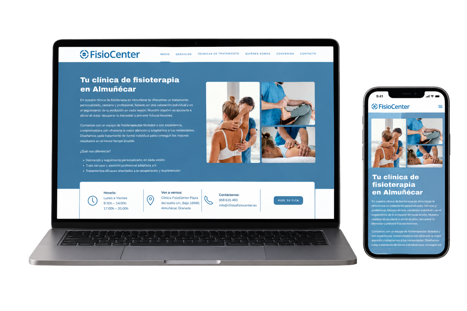
A physiotherapy website needs to build trust, explain available treatments and make it easy for patients to book an appointment.
That was our brief for Fisiocenter, a physiotherapy clinic in Almuñécar, Granada.
We rebuilt the outdated site so patients could find information, understand their treatment options and get in touch. The redesign also gave the clinic a stronger foundation for search visibility.
Why redesign a clinic website?
A website can fall behind as a clinic adds services, refreshes its brand or adopts new ways of working.
A site that once did its job can develop problems such as:
- Too much text and little visual hierarchy
- Information hard to find
- Few calls to action
- A poor mobile experience
- Limited search visibility
- And other issues that make it harder to use.
A redesign is a chance to make the site clearer, more useful and easier for patients to navigate.
Bringing the site up to date
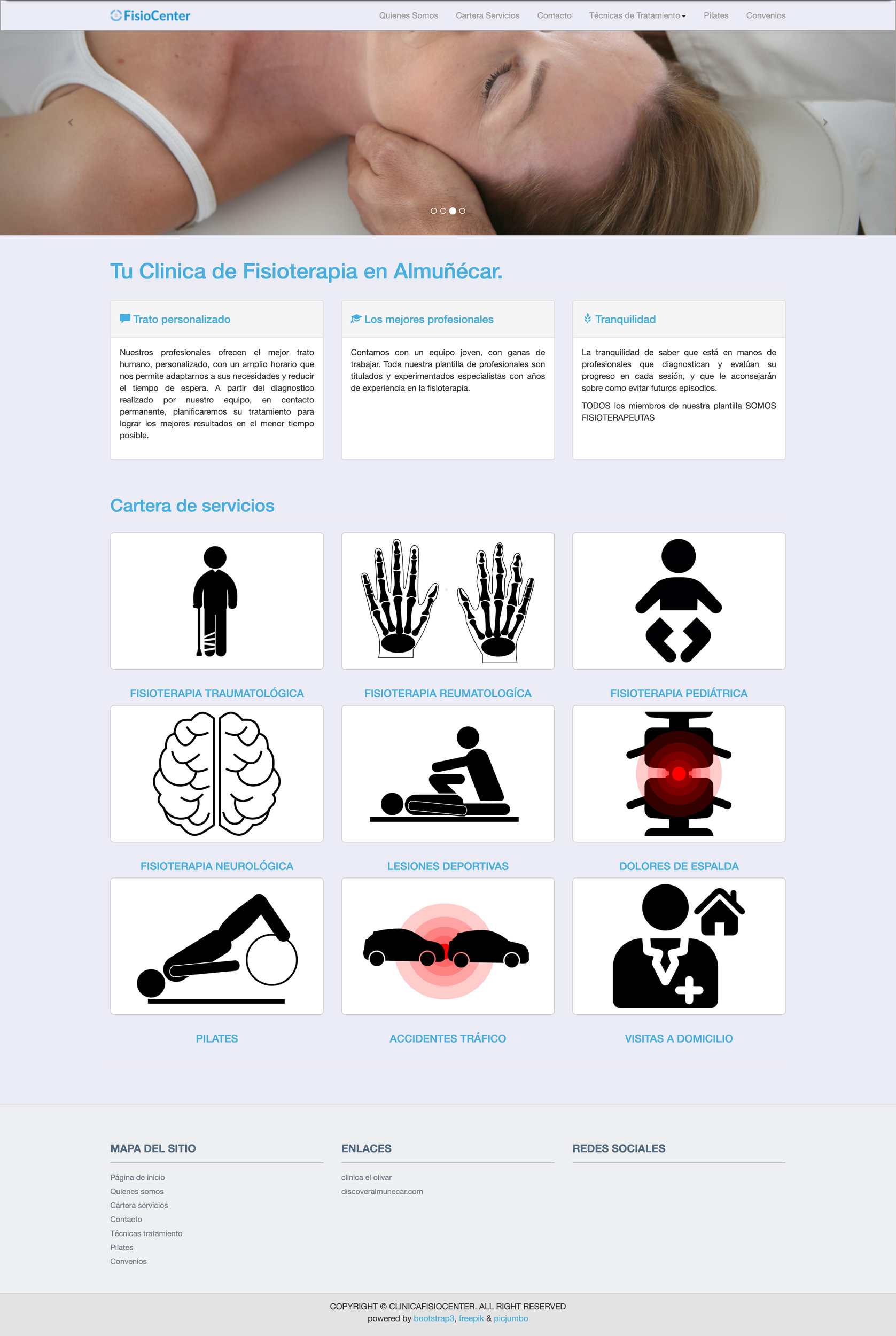
Fisiocenter’s old site described a wide range of services, treatments and techniques. It was hard for patients to find the information they needed quickly.
We restructured the information around the questions patients bring to the site:
What kind of help do I need?
Can FisioCenter help me?
What treatments are available?
Who will take care of me?
How can I make an appointment?
We used those questions to build a more direct experience:
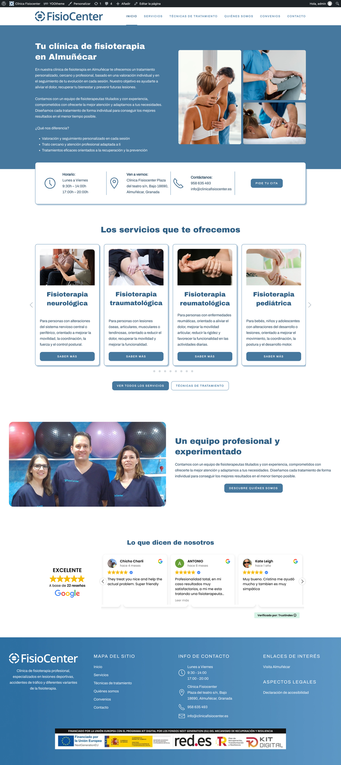
A clearer visual hierarchy gives contact details and appointment information the prominence they need.
Treatment pages use a consistent design and make it easy to read more about each service.
Team profiles and patient reviews help visitors decide whether the clinic is right for them.
Photographs show the actual team, treatments and services. The visual treatment is consistent across pages.
What improved?
- More reasons for patients to trust the clinic
- Easier ways to contact the clinic
- A better foundation for search visibility
- Updated image
A structure that puts useful information first
We reorganised the content so patients can go directly to the area of physiotherapy that interests them.
The clinic offers neurological, trauma, rheumatological, paediatric and sports physiotherapy, as well as treatment for back pain, home visits and care following road accidents.
Each type of information has its place.
The new site distinguishes between treatment services and techniques. Patients can first find a service that fits the pain or injury they are dealing with, then read about the techniques the clinic uses.
The clinic had updated its facilities and brand. The website still showed the older version of the business and gave visitors few reasons to trust it.
This website presented problems such as:
- A dated design
- Few signs that helped build trust
- Unappealing visuals
- Navigation that made it hard for patients to find what they needed
- Other barriers to getting in touch
Patients needed an easy way to browse treatments, book, find the clinic or read about other people’s experiences.
We researched comparable sites, consulted the clinic and agreed which content needed updating before starting the redesign.
The new design presents services clearly and helps patients feel at ease before they get in touch.
A clearer website centred on patients
The visual update was one part of the work.
Our goal was to improve the patient’s experience online: organise content more clearly, simplify navigation and explain treatments from the patient’s perspective.
The result is a professional website that is easier to understand and use.
. Patients can find a treatment, meet the team and book or get in touch.
Each page gives patients a clearer route to the information they need.
That is what makes a clinic website redesign worthwhile.
The site should work better for patients and for the team that runs the clinic.